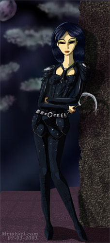
Mohna, The Progress | |
This has been my most photoshop intensive piece so far. I think I finally got to put a lot of techniques I've been reading about to use. With a good deal of feedback, and a long holiday weekend, I was able to come up with something I'm quite proud of. This is the first time I've taken comprehensive snapshots during the process, so bear with me. | |
 | The sketch. Pencil on paper. I actually sketched with a red pencil first, and then chose the lines I liked and went over them with pencil. No inks. Unfortunately, I scanned in black and white, so I couldn't just drop out the red, I had to clean up the sketch quite a bit. That included shifting her hips over to the right a bit. She was a bit broken. |
 | Here I started blocking in the basic shapes and colors. I'm not quite sure how to make her eyes look right. As a tiefling, her eyes are supposed to be completely black, I wasn't so sure about their shape either. The shape here is based on the sketch. I threw down some color for the background. In Photoshop, I've got the sketch layer on multiply mode. I'm using layers for skin, base armor color, armor highlights, armor shadows. Also, up in the left corner, I've got a little notation to help me remember the light source. |
 | Blocked in some potential backgrounds here, and started some fine highlights on the armor. I tried to put a lighter line right next to a dark line, based on the sketch. This seemed to pop out the armor as pieces. At this point, I had no clue how to maintain the hair, I knew it needed to be black, but lost my sketchguidelines under that mess. Experimented with a more olive skin tone. Added some layers for skin tone shading. Still working on the eyes, notice she still has whites. Feedback at this stage mentioned that it looked like the front of her hips was broken. Some strange shading, I guess. |
 | Decided the background was too bright for the night time I was thinking. Added some prelim cloud shapes, moon, random pillar/wall bit, at this point thinking the ground was going to be tile or cobblestone like. The biggest change is the silver edging here, which seemed to help things stand out. I was moving all over the picture, so I made myself a pallate layer, so I could easily grab the eyedropper, and have the right colors. I don't remember what the purple fog was all about, likely a holdover from a few steps ago. Husband suggested eyelids may help, those appear here. Tried some random shadows on the wall. She has no connection with the background. |
 | Big change here, the Hair! Pretty much done. Decided pure black was impossible, went with blue highlights from the moon. Still not happy with the background color. Sickle got some treatment too. Added hotter highlights to the metal bits. She still seems like she's floating above the background. Textured the shins a bit. Purple fog has dissapeared. Feedback at this point mentioned the right foot looked far too tiny. |
 | Bit of work on her face, more highlight details. The shadow on the ground helps connect her a bit, but the wall doesn't reflect that she's there. The foot gets fixed here. Looks a lot more sturdy. |
 | Just had to redo the wall, the other was far too muddled. Lost the ragged edge though. Worked hard on the floor to come up with something that has a bit of perspective. Added a few additional shadows, and worked with the background a bit. I'm a lot happier with the color of the night sky here. Eyes still aren't right. |
 | Extended the shadow to cast from her larger foot. Lots and Lots of work on the background, moon, clouds. Help and Inspiration from Neon Dragon Art : Dragon Paint Tutorials. Changed the eyes a good deal, but they may be too dark here. Used a selection tool either on the wall or a mask for the wall, and deleted the edge so it wasn't so straight. Added a nice shadow to the wall, based off her outline. I might have tried to mess with a pernumbra like Merekat suggests. At least I thought about it a bit. |
 | Final Version Dialed back on the eyes just a tad. They still look creepy, but not too unrealistic (for this style). I'm happy with how she connects and blends with the background. Some people think she blends a bit too much. It seems to vary, based on the monitor. I'm sure I could have pushed this farther, but sometimes you just reach a point where it's good to stop, and move on to other pieces, taking what you've learned and apply it to the new things. I had wanted a slightly more complex background, with the Red Wizard's tower in it, but it just didn't look right the way I tried to put i t in. This pic pushes quite a bit farther than most of the art posted on Metahari. She has a slightly more dynamic pose, she's not an elf, there is a background, and the coloring seems quite more advanced than my picture of Kara. |
| Return to the Gallery | |